Hi, my name is Aimee Crowther and I’m a 16 year old living in Ontario, Canada. This blog is made for my photography class and I hope you enjoy my photos. Please feel free to leave some comments for me and feedback on how I can make my photos better or how I can make by blog better.
I absolutely love to travel so everywhere I go, I always have my phone on me or my camera and I am out taking pictures. It is a goal in life to be able to travel all over the world to see the different ways people live and to be able to experience different things.
The pictures below are some places I’ve been and captured some amazing photos that have to be shared. Sunsets and sunrises have be one of the most beautiful things ever, no matter the place.
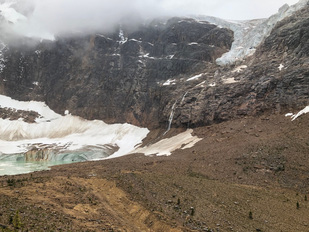
Mount Edith Cavell, Alberta 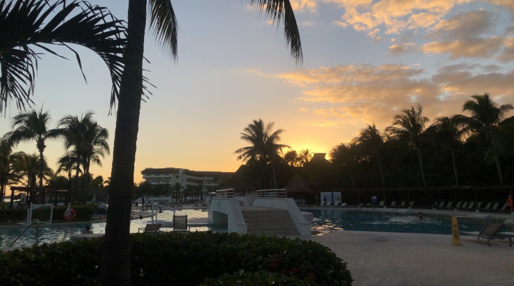
Blue Bay Grand Esmeralda, Mexico 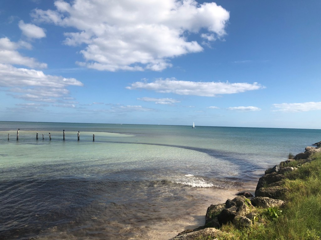
Quintana Roo, Mexico 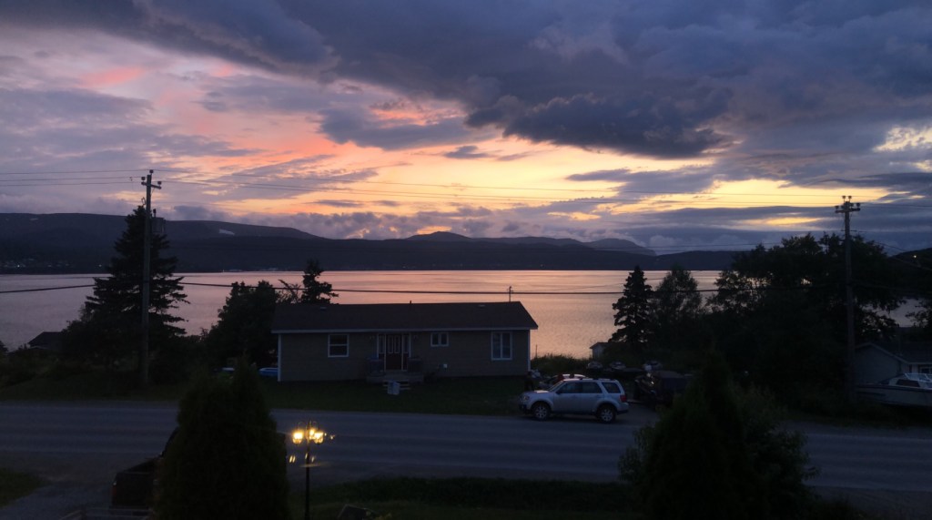
Gillams, Newfoundland
Welcome to my Photography Blog
Turquoise
By Aimee Crowther
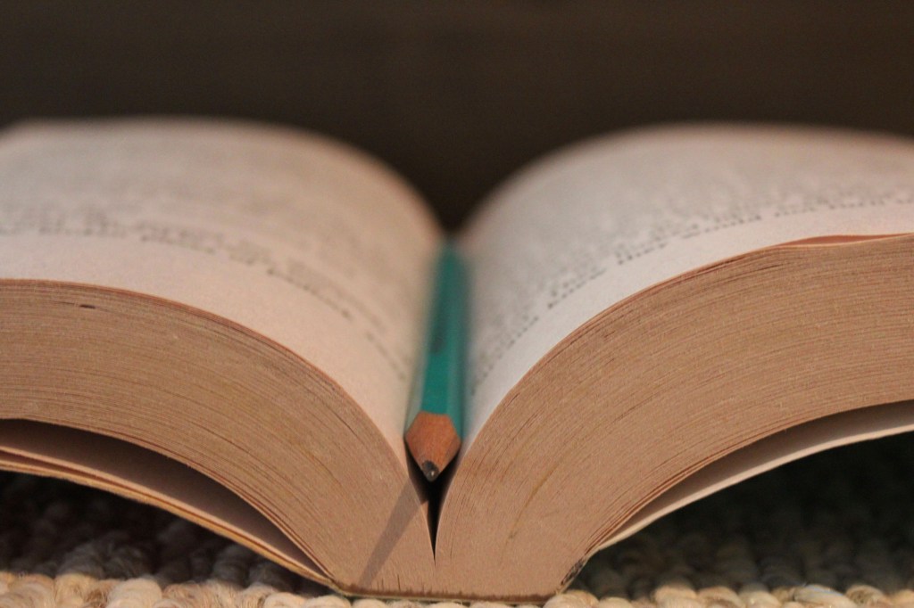
This photo was taken in my room, on the floor, nothing special. I had my room light on and the lamp in the corner just to add some extra light but my room isn’t really that bright with both of them on anyways.
Turquoise is my favorite because the photo is simple, yet it looks beautiful and picture-perfect. One day I got home from school, it was about three weeks ago and I thought that it would be a good time to take some photos even if they were just around my house, I could get creative! It was a sunny day, so I knew some light would come in through my blinds and make my room the perfect lighting to take some photos. Turns out this is my favorite photo I took for my Photo Assignment two or Extraordinary Shots.
The pencil in Turquoise leads your eye through the whole image, and you can tell that the pages are smooth in the book. Since the book is plain and the background and foreground isn’t super exciting it really emphasizes the color and shape of the pencil. You can see the carpet and the texture of kind of rough material and at first, I didn’t think I would like it with the carpet but it helps make the photo more interesting and gives you more things to look at.
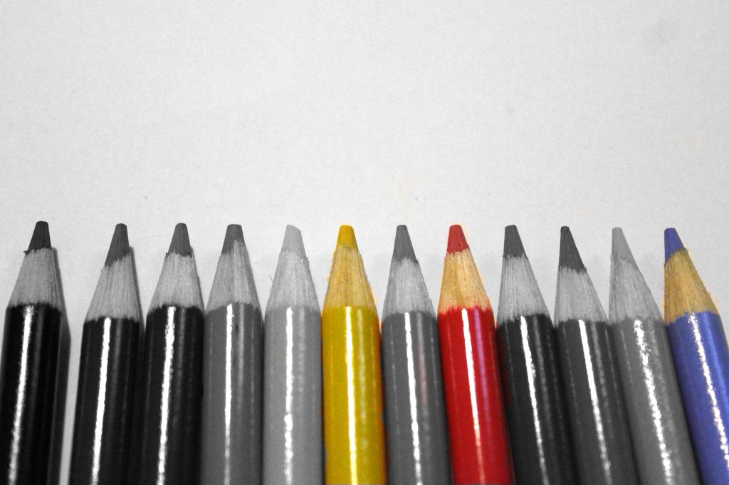
A box of crayola pencil crayons and the back of a white note book and you can create the exact same picture. This photo was not hard to do at all. Placing the pencil crayons down and lining them us, then taking the picture. This photo was for assignment three, which was composition guidelines.
Primary colors are the only colors shown in this photograph, and it’s because it makes the photo simple yet interesting. Because this was for the composition guidelines assignment, it is clear that I was going for rhythm. But now that it is edited, it also shows rule of odds.
The original plan for this photo was to just put a black and white filter over it and call it done. After realizing that black and white would be to boring I noticed the primary colors. Keeping it in black and white, I deleted the filter over the three pencil crayons to let the color come back through. I also cropped out some of the negative space around the pencil crayons and made a tight crop on either side.
Primary
By Aimee Crowther
Bubbly
By Aimee Crowther
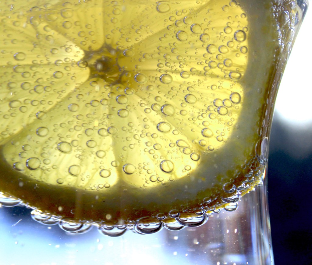
A picture of a lemon in a glass of sprite. How many people actually think that in the middle of the day they are just going to do this? I took this picture at my cottage in up north. It was sunny this day and that’s why the lemon is lit up mostly on the bottom half. Since it was in the evening the sun was setting and just about to go under the tree line. This picture was for assignment four, our macro photos.
Composition guidelines play a big part in this people. Since the lemon is not fully centered, and the centre of the lemon is in a hot spot and not in the centre it looks more appealing. Lighting also plays a big part in this photo. The sprite is clear and lit up with the blues and whites of the sky, the color in the lemon pops more then it would if this photo was taken on a darker gloomy day. Also, since everything inside of the glass is so bright and the right side of the photo is so dark, this photo also has some contrast.
Out of all the photos I have taken over the past five months this has to be my favorite out of all of them. After the picture was taken, I did do some editing just to enhance some features. When the picture was taken it was darker, so I used my levels tool in Photoshop to bring them up and make the overall photo lighter. I also added a brightening filter over it and cropped it so that there wasn’t to much negative space around the lemon and glass.
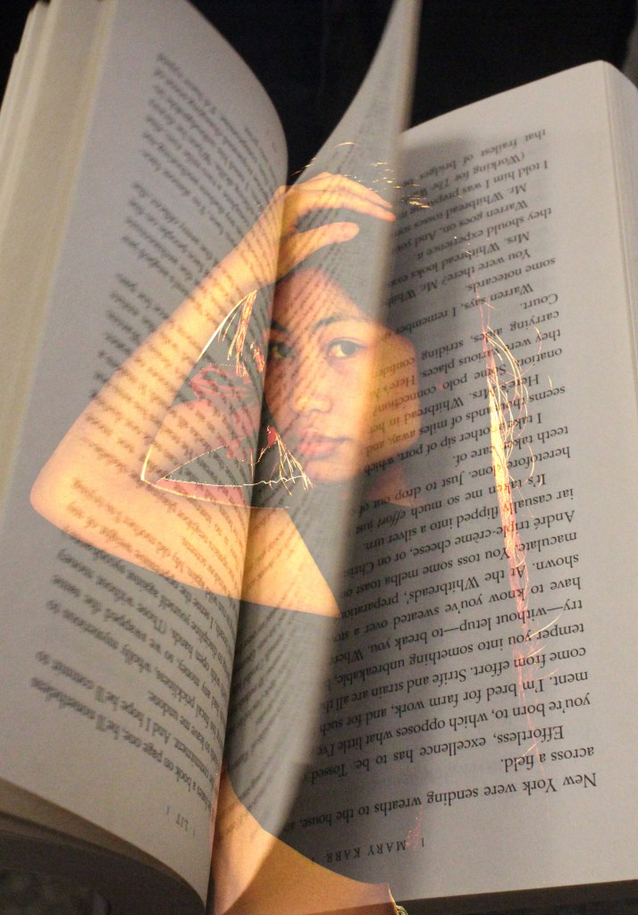
Every single person I asked, said that this photo could be for the cover of a romance novel or movie, hence the name of the piece. I took a photo of a book that was catching movement from our very first assignment and the rim lighting photo I took of Anny for our assignment five, which was different lighting methods. Since the background photo was rim lighting it had to be taken in the studio with a light coming from behind Anny, but the photo of the book was taken in the library with the lighting of the big glass windows.
Automatically my eyes are dawn to Anny of course because she is the center of interest, but with the book being there my eyes are also lead with the lines up and down the photo over top of Anny. Since the photo is very dark, the pop of color from her lips and the red scrunchie on her arm make the photo more interesting and not just a dark washed out photo.
This is a multiple exposure shot, meaning it was edited in photo shop. That being said, the book was not edited at all but the portrait was. On the rim lighting photo i cropped around Anny to bring the frame closer to her and get rid of some negative space around her. I also used a brightening filter so that she didn’t look so washed out, and brought up my levels to overall brighten the photo. Out of the five multiple exposure shots we created this was my second favorite as I used my favorite to wrote my critique.
Romance
By Aimee Crowther
Natural Beauty
By Aimee Crowther
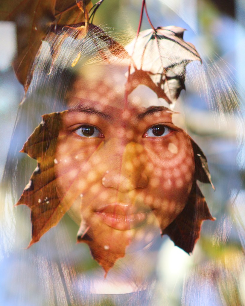
I believe that this photo shows the natural beauty of both Anny, my model, and mother nature in the peak of autumn. The brightness around Anny and the leaves make it feel like she is the center of attention and personally looking at this photo it feels like this photo could be on the front of any magazine that is motivational and empowering.
When I placed the photo of Anny down first, I didn’t purposely place the leaf right over her face because I was just trying to get the settings right for the photo. It was almost like luck when I blended the photos together and the leaf over Anny’s face was just slightly off-center from her face, but adding character. The different lighting on each photo makes it more interesting as it looks like glare around Anny’s face, but you can still see all of the details of her hair. Since my portrait was for directional lighting, Anny already had the circles on her face. It adds character and texture to the photo and you can still sense the directional lighting in the photo. If I put this photo into black and white I think it would make it look more serious and that wasn’t the look I was going for. I feel that the leaf in the corner should be full and that the white rectangle throws it off, making it not look full.
Since both photos are in sharp focus you can see every little detail, making the photo more interesting and making it have unity. Because the photo of the leaves has a bright blue background and the background of the portrait also has a somewhat bright background, it makes all of the space around Anny’s face be in focus but not something that your eyes are automatically drawn to. Although there is a bright spot in her hair that the sun was shining on that my eyes go to. The blues, whites, and greens around Anny could have a little bit more color and prominence to make the photo even more intricate but it doesn’t absolutely need it.
There wasn’t a whole bunch of editing put into the photo. I did place the photos on top of each other to make the multiple exposure, using the blending mode “screen” and it was cropped to make sure that there was not too much negative space around Anny’s face. I did use the clown stamping tool and blended out the leaf in the top corner as well. After the image was flattened I used my levels tool to bring up the brightness a little bit as the leaf over Anny’s face made her underexposed.
Overall, this is my favorite multiple exposure photo. If I were to go back and edit this photo I might put a black and white filter over it and make it look more serious as Anny does have a straight face and she does already look serious.
Ralph Hattersley
“We are making photographs to understand what our lives mean to us.”
Andy Warhol
“The best thing about a picture is that it never changes, even when the people do.”
Dorothea Lange
“Photography takes an instant out of time, altering life by holding it still.”
 Aimee Crowther's Photography
I love all of your photos, but my most favourite one is probably your macro textures one. I love how the lemon looks like in the glass of sprite, because it created the bubbles around the lemon. The bubbles around the lemon is very intriguing to look at. I like how you cropped the photo because the important parts of your photo are hitting the hotpots. I love the light at the bottom of the glass looks because I feel like it is bring more colour in the photo. Overall I love your work. Keep up the good work.
LikeLiked by 1 person
Thank you! I really like this photo as well. I agree with the pop of color from the light at the bottom of the glass, I feel that it pulls the whole image together.
LikeLike
Aimee, In my opinion your multiple exposure image called Natural Beauty is by far my favorite image on your blog. Just the way that Anny’s face almost fits perfectly inside the one leaf makes the image so much better. I also love how her face is more visible inside the leaf that outside of it. I also love the lighting which is on Anny’s face.
LikeLiked by 1 person
Thank you! That is my favorite photo by far aswell!
LikeLike
The bubbly photo is definitely my favorite out of all of them. The drops on the outside of the lemon are ready to drip off so your eye gets attached to that. Also, the bubbles in the lemon are the most interesting part of the photo. I’ve seen many lemon photos but not many with bubbles inside the lemon. So it is a very interesting photo.
LikeLiked by 1 person
Thank you Katie! I really like the lemon photo too, and your right, the bubbles on the inside of the lemon do add more to the photo.
LikeLike
Hi Aimee!, I really liked your composition “Natural Beauty” because of the creative merging of the two photos and the directional shadow added to the photo as well. I like the element of space used by having the model take up more positive space in the overall photo and having less negative space. I think that you also used the element of colour very well because of the focus and lighting of both the images. You also used an effective number of principles of art in your photo such as emphasis, unity and balance. I also love the directional shadow that is used in the portrait because it gives it an interesting look. Overall, I think the merging of the two photos you did was very creative.
LikeLiked by 1 person
Thank you Zoha! I agree, I really like this photo as well.
LikeLike
Aimee, your photography blog is very visually stunning and includes excellent written commentary for the photos you chose to include. Your introduction and famous photographer quotes at the end adds a nice book end to the content on your page. Well done!
LikeLiked by 1 person
Thank you Mrs. Merritt! I’m glad you liked my blog!
LikeLike
Love all your photos! My favourite is probably your macro one, i love how you can see the detail of the lemon and all the bubbles, nice job !
LikeLike
Thank you, Lauren! I really like this photo too!
LikeLike
Aimee, your photo called Bubbly is by far my favourite on your blog. I love how the bubbles and the texture of the lemon are balanced and that one it not outshining the other. This photo is creative and so cool to look at. I also love how the bubbles are surrounding the outer layer of the lemon.
LikeLike
Thank you Hamda! I really like this photo too, and I think that the texture of the lemon is really enhanced by the sprite in the cup making it really pop!
LikeLike